You like the cool XKCD Look and Feel of the teaser chart? Then this post is what you are looking for!

The chart is derived from the pie_demo_features.py and slightly adapted to the topic of this post.
This post shows how to set up all the tools needed to create your own XKCD-style charts.
A while ago a friend hooked me with his cool classroom setup which he uses to teach Python: Jupyter Notebooks and Matplotlib with inline preview.
As a goodie he showcased some of his cool charts with XKCD style and pointed me to the Pythonic Perambulation blog for more details:
Finally, I found some time and decided to prepare a local setup. Since it wasn’t a simple one-liner I decided to share a Docker setup.
There is already a good bunch of Jupyter Docker Stacks out there to Selecting an Image from.
Since we want Matplotlib we go for jupyter/scipy-notebook.
$ docker run -rm -e JUPYTER_ENABLE_LAB=yes -p 8888:8888 -v "$PWD":/home/jovyan/work jupyter/scipy-notebook
That was the one-liner I thought would be enough.
But it wasn’t. It gave me some error messages when loading the font HUMOR-SANS.
Install the font HUMOR-SANS
xkcdsucks is proud to present HUMOR-SANS, the xkcd font!
Lucky us, we don’t need to manually fiddle with the font installation.
It’s already packaged as fonts-humor-sans, but…
$ apt-get update
$ apt-get install fonts-humor-sans
didn’t work out as expected on the first try :( More research needed…
An additional rm -rf /home/jovyan/.cache/matplotlib/ fixed the problem for me and the plots picked up the proper font.
You may check the result with fc-list when inside the container:
$ fc-list | grep Humor
/usr/share/fonts/truetype/humor-sans/Humor-Sans.ttf: Humor Sans:style=Regular
Prepare the Docker Setup
Let’s put the setup into a Dockerfile.
FROM jupyter/scipy-notebook:e8613d84128b
# Only hashes available in https://hub.docker.com/r/jupyter/scipy-notebook/tags/

USER root

RUN apt-get update
RUN apt-get install -y apt-utils fonts-humor-sans

USER jovyan

RUN rm -rf /home/jovyan/.cache/matplotlib/
For convenience I’ve also put together a basic docker-compose.yaml that handles the ports and environment variables as well as mounting a local directory for persistence:
version: '3'
services:
  xkcd:
    build: .
    ports:
     - "8888:8888"
    volumes:
     - ./work:/home/jovyan/work
    environment:
      - JUPYTER_ENABLE_LAB=true
      - JUPYTER_TOKEN=xkcd
Note: The snippet above sets the token to
xkcdwhich you’ll need when first accessing Jupyter locally.
Fire up the prepared XKCD environment with:
$ docker-compose up -d
…and you are ready to launch a Python 3 Notebook to start creating your own XKCD charts!
Go to http://localhost:8888/ type in the token xkcd and choose a Python 3 notebook…
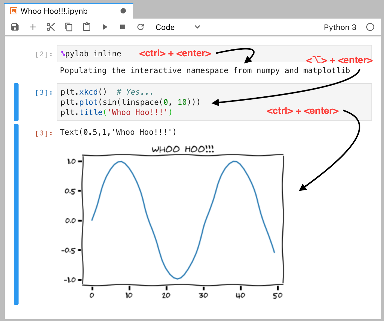
Whoo Hoo!!! example
The Mac version of the Whoo Hoo!!! example for absolute Jupyter beginners.
The first thing you should do is enable the inline backend for usage with the Notebook to get a nice preview of what you’ll do next:
%pylab inline
Populating the interactive namespace from numpy and matplotlib
Tip: Hitting
<ctlr>+<enter>will execute the code and result in the output shown above.Tip: With
<⌥>+<enter>you’ll get a new field to put your chart code into:
plt.xkcd()
plt.plot(sin(linspace(0, 10)))
plt.title('Whoo Hoo!!!')
Another <ctrl>+<enter> will print the chart inline.
Teaser example
Just for completeness, the code of the teaser chart:
plt.xkcd()
# The slices will be ordered and plotted counter-clockwise.
labels = 'Docker', 'Python', 'Fonts', 'XKCD'
sizes = [30, 10, 35, 25]
colors = ['yellowgreen', 'gold', 'lightskyblue', 'lightcoral']
explode = (0, 0, 0, 0.1) # only "explode" the 4th slice (i.e. 'XKCD')

plt.pie(sizes, explode=explode, labels=labels, colors=colors,
        autopct='%1.1f%%', shadow=True, startangle=90)
# Set aspect ratio to be equal so that pie is drawn as a circle.
plt.axis('equal')
Bonus - save your chart
Now that we created a cool chart we want to add it to the post.
Thus we need to get the inline rendered graph to our filesystem…
In our Docker Compose based setup the local folder work is mounted into the container as /home/jovyan/work.
This way you can save the generated charts with:
plt.savefig('/home/jovyan/work/xkcd-teaser.svg')
Note: You’ll have to add this command within the same code box as your graph. Otherwise, an empty image is created.
What’s next?
Clone the fwaibel/xkcd-notebook setup and get started!
Search the XKCD examples and create some fun graphs on your own…